Refreshing a tired brand
Founded in 1992, Mapletronics is a full-service IT planning and managed services company with offices in Indiana, Tennessee, and Florida. Serving hundreds of clients from large manufacturing companies and healthcare organizations to single employee business owners thier solutions focus on four main areas: business continuity, security, stability, and support.
The Challenge
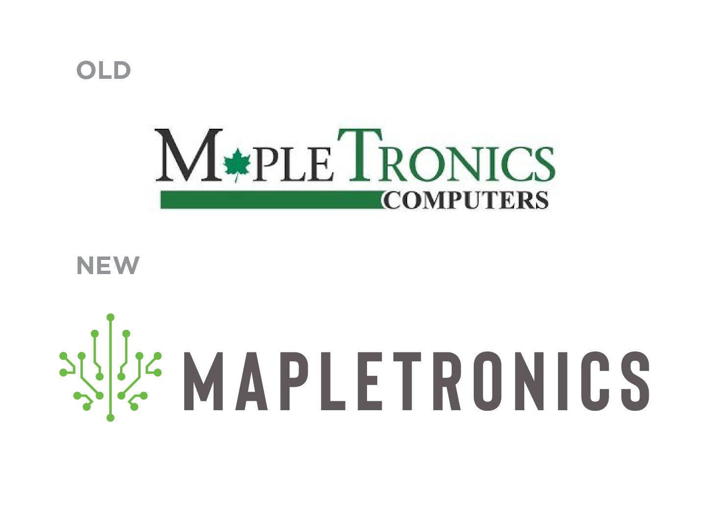
Mapletronics came to us as they felt their brand was looking tired and dated. The brief was to bring the brand up-to-date and give them a “serious player” feel without losing its core values.
The Result
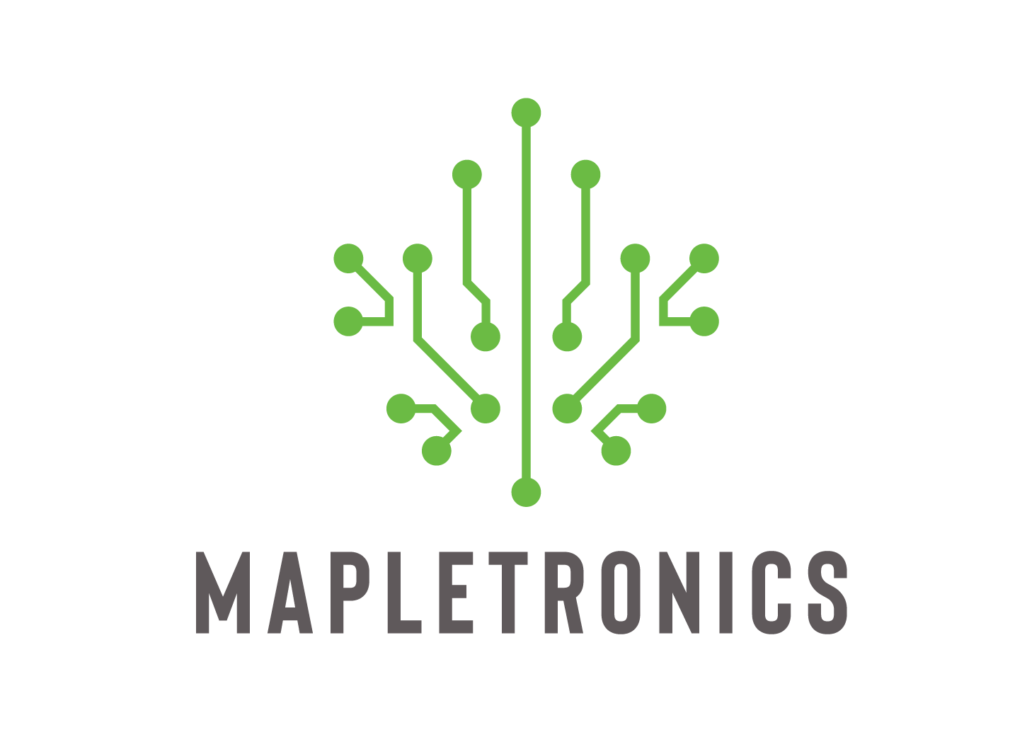
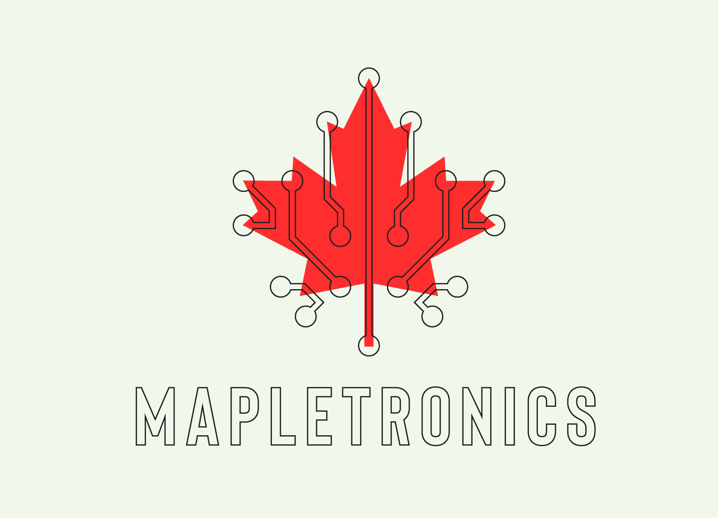
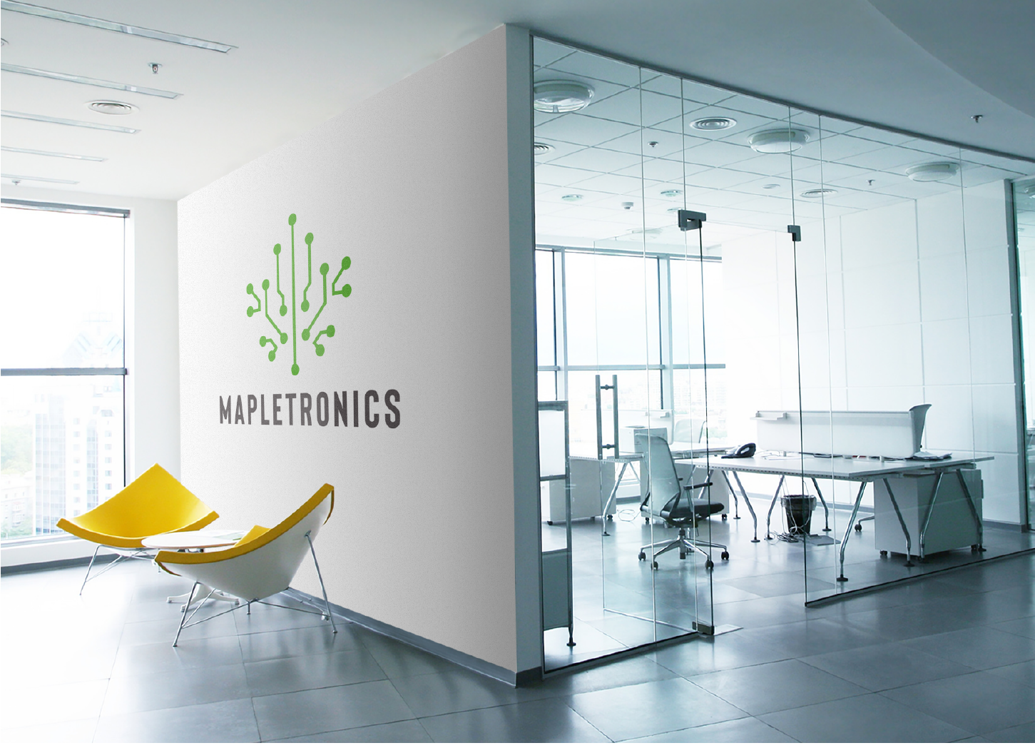
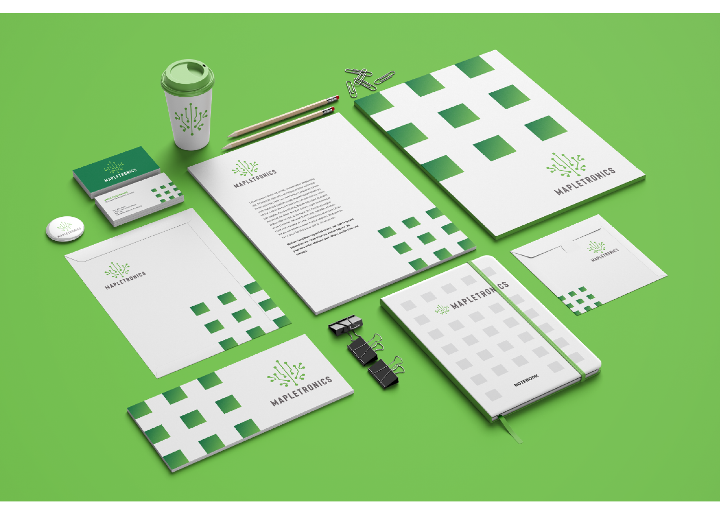
I looked into researching the company and what their name suggested, a maple leaf, and what they do, IT. I took a ‘leap of faith’ in associating the company with electronics and settled on circuit board imagery. I made this abstract so as not to confuse them as an electronic manufacturer.
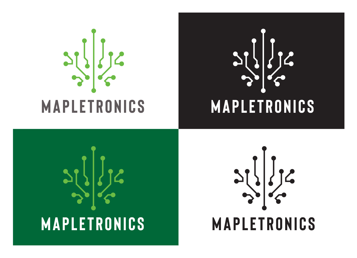
The result is this well received identity combining the leaf and circuit board into an instantly recognisable identity.
The result is this well received identity combining the leaf and circuit board into an instantly recognisable identity.